Project Type | Branding
Date Started | 07-May-2021
Client | Nanchis Bakeries and Confectionery
Project Team
- Christian Anuebunwa
- John Neche Stephen
- Chinaza Obinwugo
Project Description
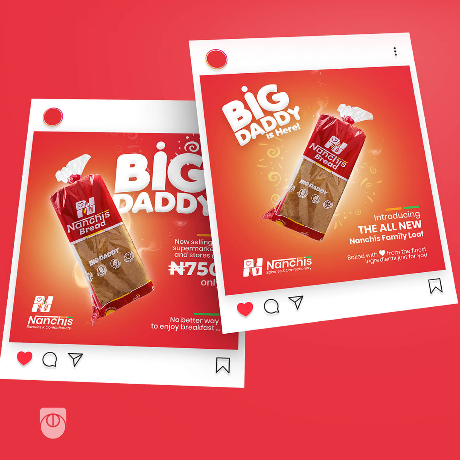
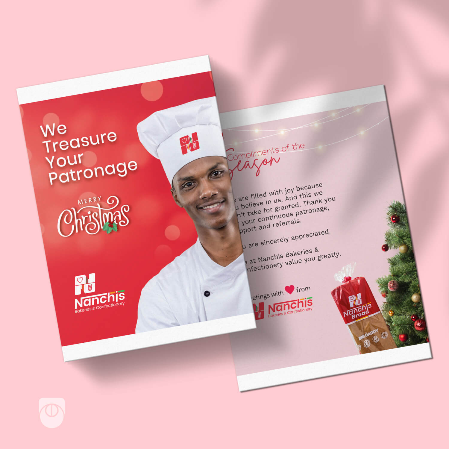
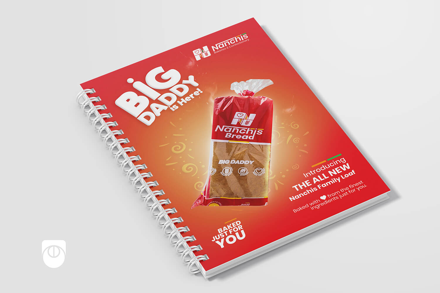
This project covers the visual identity, product package design, and marketing materials designs for Nanchis Bread. This is targeted at helping them establish a unique identity in their sector. This unique identity will facilitate easy identification and increased brand awareness for Nanchis Bread.
Company Description
Nanchis Bakeries and Confectionery was established to become the first one-stop shop for bread and pastries. The company slogan, “Baked just for you,” demonstrates the genuine interest of the company in its customers and its commitment to constantly improving its products and services to ensure customer satisfaction.
Nanchis bread is baked with quality ingredients and made accessible to both average and above-average income earners.
Branding Colours
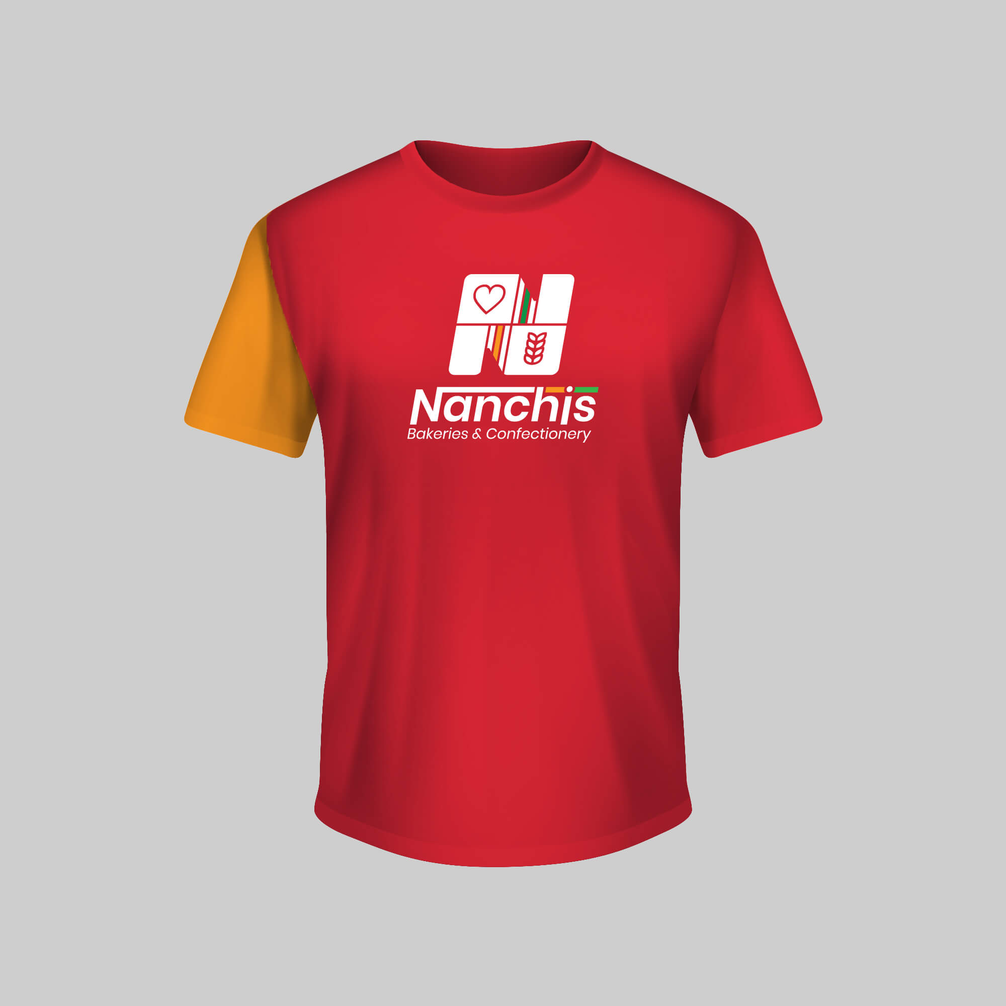
Red is Nanchis’ main colour, with orange and green serving as supporting colours. Red stimulates appetite, hunger, and draws attention. Orange evokes feelings of friendliness, while green symbolizes nature, growth, and liveliness.


The Nanchis logo reflects two main concepts: “Care for Our Customers” and “Wheat is Wealth.” The heart icon represents the company’s commitment to customer care, while the wheat icon symbolizes prosperity, growth, and the richness of Nanchis products. The logo features a bold slanted N, which stands for Nanchis, and is designed to convey forward motion. The chosen typeface complements the logo mark and has been customized for the brand name.


